Confidence is a Gift We Give to Others

I love what I do! Not only do I meet the most interesting people but I get to instill confidence. Often our perspective gets skewed by the beautiful people we see in the media. It becomes a belief that a few pounds need to come off, that makeup should be on point, trendy outfits need to be purchased, and that time needs to be kinder to our skin. That’s not true! All you need to do is show up! Your picture is a chance to present who you are and the photographer is just your mirror. It's time to be proud of your face!

self-portrait

I wanted to lead by example in this self-portrait and be as real as possible. No makeup because I don’t like wearing it every day, an old tee-shirt that I shouldn’t love so much, and hair that is just doing whatever it wants. I think sometimes we believe confidence is for ourselves but in my experience confidence is also a gift we give to those around us. So, show up in your pictures. Stop waiting for something to be better and start loving who you are today!

Arranging your headshot for LinkedIn

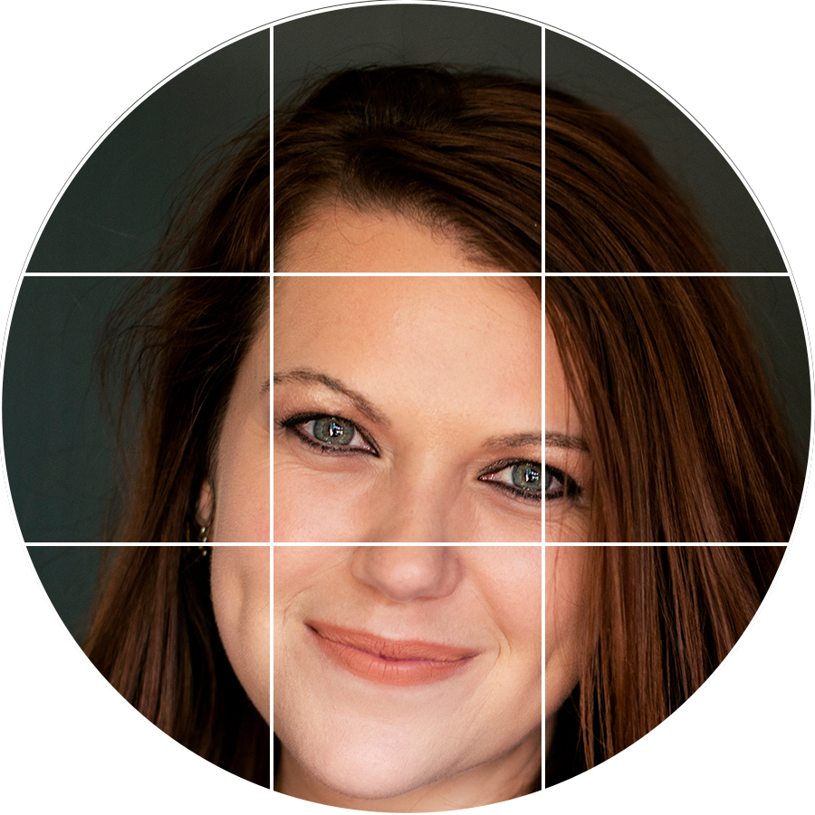
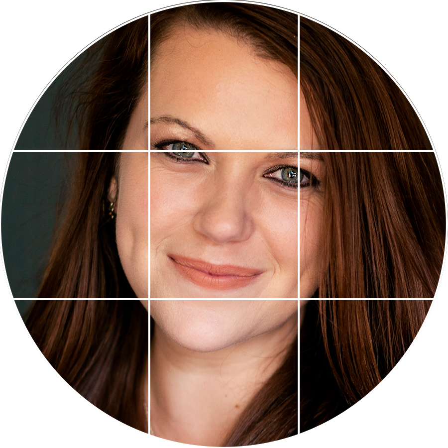
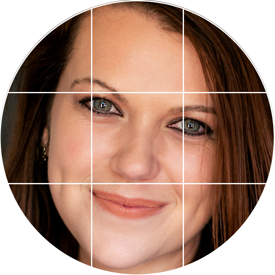
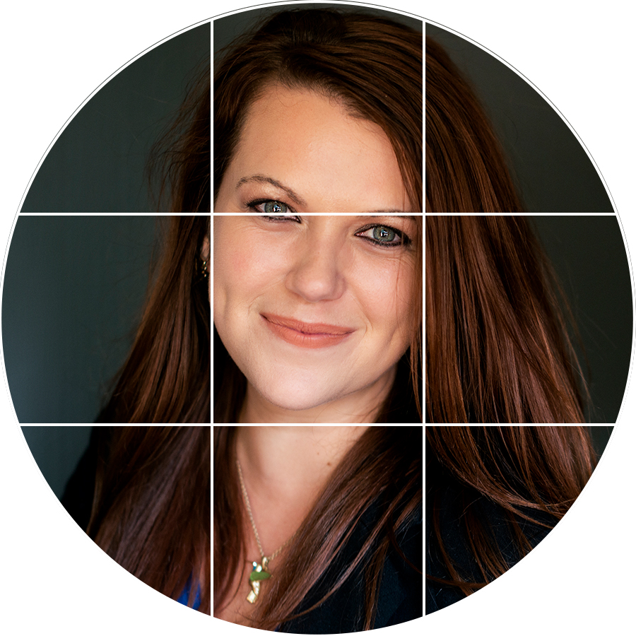
If you have dabbled in photography, even a little, chances are you have heard of the rule of thirds. It's a compositional suggestion to create impact in your pictures. The rule of thirds is when your image is divided by thirds horizontally and vertically. Here is how to understand the rule of thirds for your LinkedIn profile picture.

Let's start with the eye line. It is the top third line. And like the name suggests that is where the eyes of your subject should be placed. 

eyeline.jpg

Above Dana's eye is on the eye line (the top third line). As you enlarge your headshot you might notice that the top of your head gets trimmed off at the top of the frame. It is ok! The crop will work like bangs in a hair cut. What you want to avoid is cropping right under the chin. It give the feel that you are being decapitated. Not good.

A couple more things to keep in mind. Center your images. Silly thing to mention when rule of thirds is all about being off center. However, in the LinkedIn format, non centered images look like you don't care about the details. One exception is if you are looking off to the side. Then leave a little more room the direction your noise is pointing.

Also avoid making your headshot to big. Give the viewer some breathing room or space around your face. Closely cropped images where only your face is visible, is uncomfortable to look at and too intimate for the business feel of LinkedIn.

Now keep in mind these are only general guidelines. And there are plenty of exceptions to the rules. If you want to have honest feedback on your LinkedIn profile composition ask me! I am happy to help!